Overview

Email rebrand
Synopsis
While collaborating with Paxful's CRM team, we established goals and expectations for the new email templates. We addressed new approaches and layouts that could work well visually while keeping user interaction in mind.
Goals
With our redesign in mind, we wanted:
Emails that reflected the companies new branding
Versatile email templates that the CRM team could use for a myriad of events and announcements
Layouts that are clean, comprehensive and direct readers to the information they are looking for
The outcome
A clean and minimal approach that pairs branding and function. The emails conveyed information clearer for the reader, and email interaction metrics had increased once we launched the redesigns.

Social photography
Our product
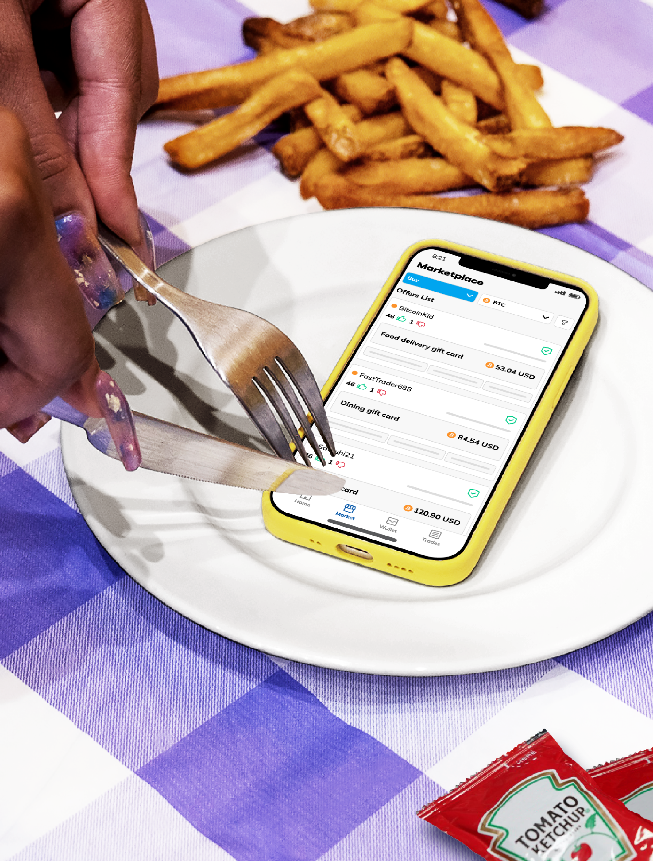
When it came to social content at Paxful, we often highlighted our product through screenshots and illustrations. However, we noticed higher social interaction numbers when the post included photography and motion graphics. With that in mind, we as a design team, took this as a challenge to bridge the gap of our digital product and the use of photography.
Next steps
After pitching our concept to the wider org and acquiring approval and funding, we were ready to hit the ground running, acquiring props and studio space for our product photo shoot.

That’s a wrap
After the photoshoot was complete, we moved to editing our best shots. While simultaneously designing and directing assets for the video motion team to animate.
Vector graphics
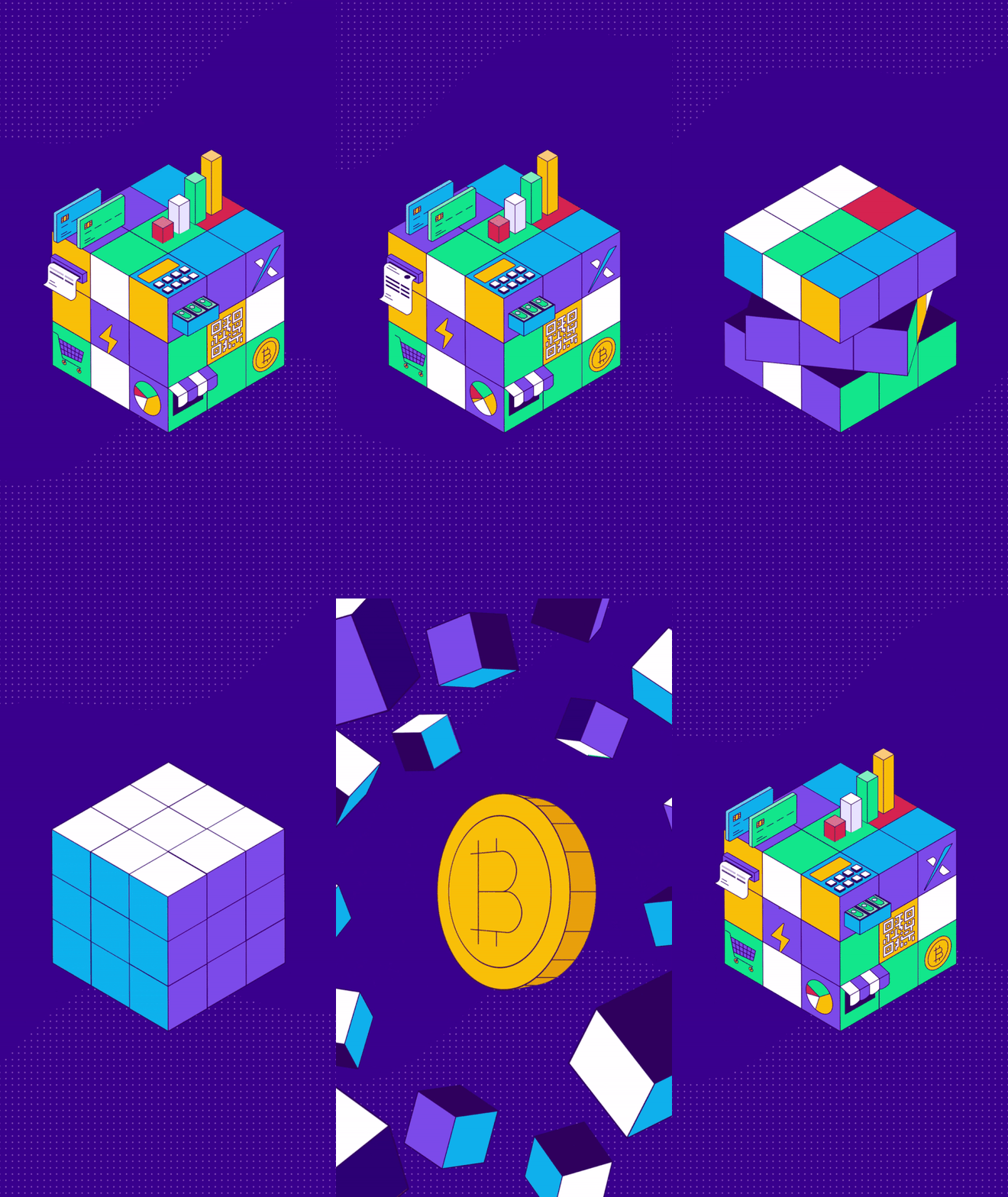
Part of my responsibilities at Paxful included creating a range of vector graphics for our brand, everything ranging from social media assets to storyboards for animation.
I spy with my little eye
During one of our social brainstorming meetings at Paxful, I pitched the idea of creating ‘I spy’ graphics as a part of that months social posts. My goal was to create an eye-catching and complex illustration that would encourage our social followers to engage in the visual game. This initial concept was received so well that our social team asked for reoccurring ‘I spy’ themed posts to be added to their social media schedule.

Blog headers
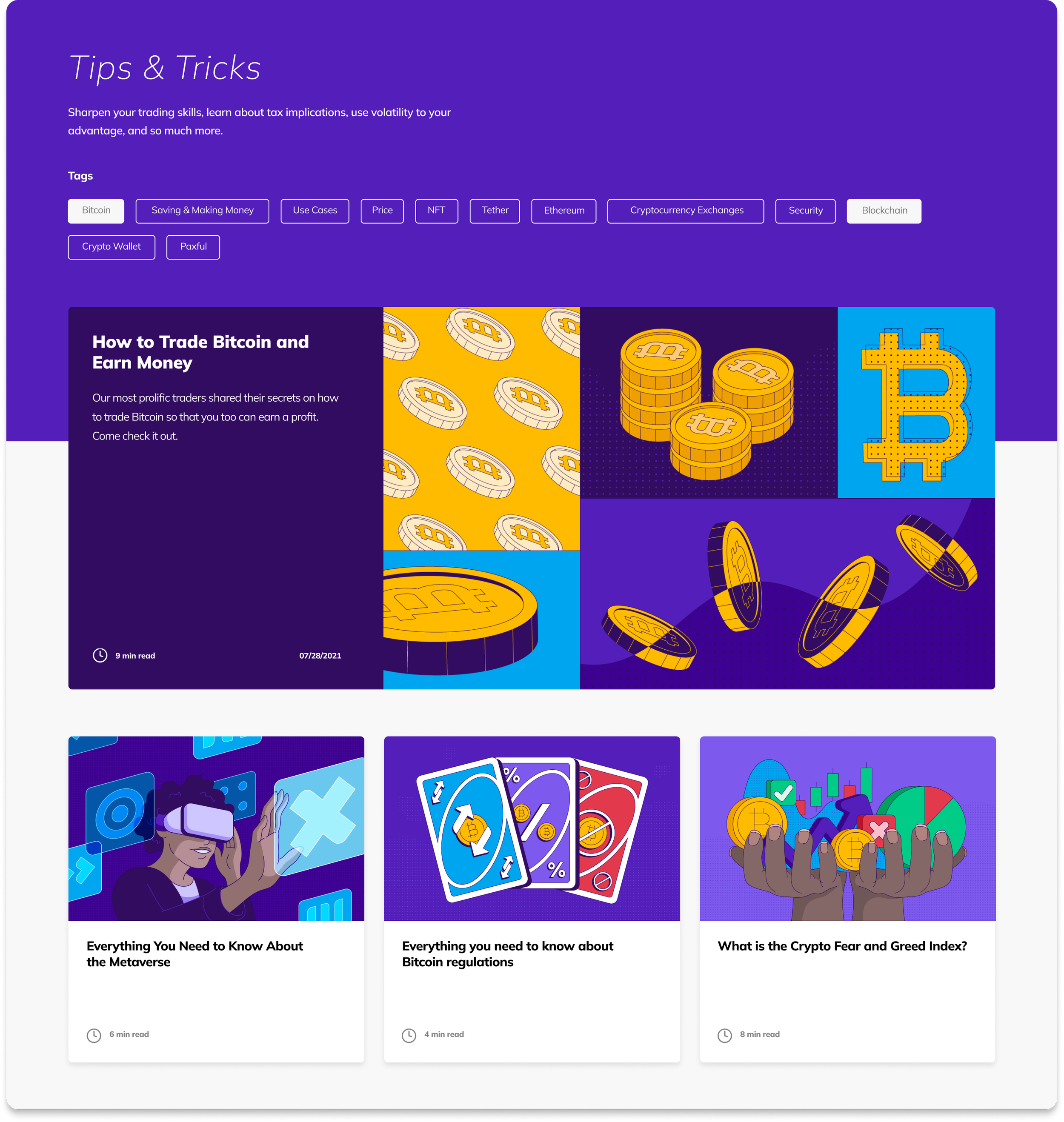
Part of Paxful’s initiative is to educate their users on cryptocurrency through weekly blog content. To catch the users eye, our blog headers were created to be very conceptual while still staying within the blog topics.

2D animation for social
One of my favorite reoccurring design tasks was working with the Visual Motion team. Often times illustrating, story boarding and directing animations that helped highlight the use of Paxful or showcased our brands fun and playful nature. Here are a few of my favorite projects:

Stylized UI
Simplifying the product for brand marketing
To help explain Paxful’s product in our brand marketing, some simplification was needed. I started by selecting the most important screens that best reflected the app, and then visually broke them down so they would be easier to understand at a glance. Once I landed on a good balance of function and simplicity, I created a library of visuals for the org to use on their own projects. These would be used for photography mock ups, vector graphics, and product walkthrough videos. Below is just one example of that simplified UI applied to animation. For that project, I created a storyboard showing potential users an overview of Paxful and what they can expect while using the app.


